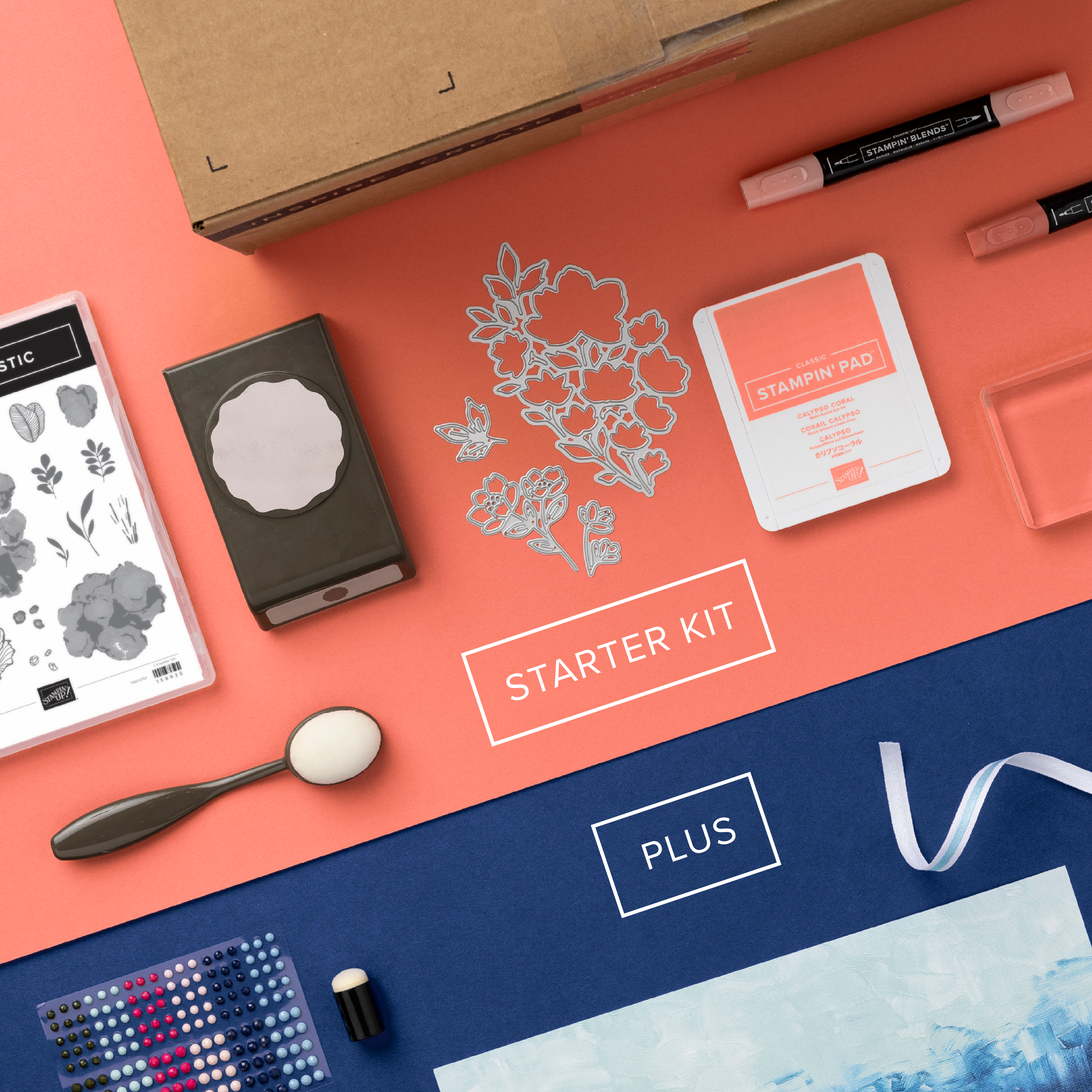
Starter Kit +
My promotion design for Starter Kit + was intended to persuade new demonstrators to join the Stampin' Up community by offering them more products at a reduced price. I used color contrast in my design, with one color representing the initial product offer and another representing the free additional product included in the promotion to emphasize the value of the offer. Through this combination of effective visuals and a clear message, I successfully communicated the benefits of joining the SU community.
The promotion design I created focused on persuasion techniques in graphic design, such as bright colors, bold text, clear images, and strategic placement. I used these elements to create an effective visual that could quickly capture the attention of our target audience. Additionally, I included an informative call to action to encourage potential demonstrators to learn more about the program.


